Photo credit: Canva, Jupiterimages from Photo Images (left, cropped) / thecorgi (right, cropped) – She landed a job with help from a "meme" application.
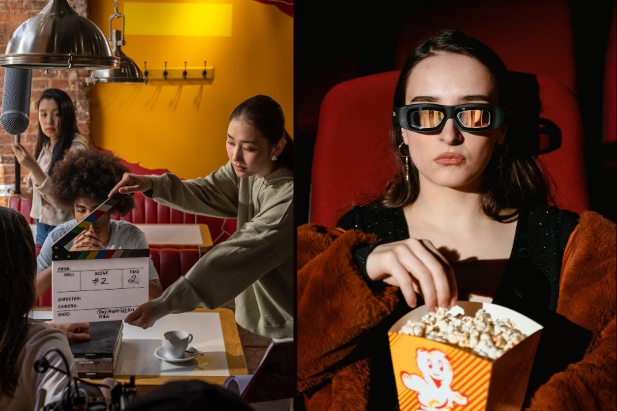
Photo credit: Canva, Ron Lach from Pexels (left, cropped) / Tima Miroshnichenko from Pexels (right, cropped) – These three films have the most incredible opening-credits sequences.