Economists Ricardo Hausmann and César Hidalgo released their Atlas of Economic Complexityat the Harvard Center for International Development on Thursday. The 300-plus page atlas is unlike any you’ve seen before—it doesn’t inform readers where they are geographically, and it won’t be any help when charting pan-continental adventures. But from an economic perspective, the atlas will tell readers where their countries rank in terms of productivity—and, most astonishingly, where it will be in 10 years.
It’s not a crystal ball, but it could very well be a map for global investment over the next decade. Plus, it sure is pretty to look at.
The atlas starts with the idea that the wealth and potential of nations is derived from productive knowledge. To maximize collective knowledge, a nation needs to connect its individual citizens, each of whom can benefit the whole. The more complex and interconnected a nation, the greater its economic productivity and potential. The atlas visualizes the economic complexity of 128 countries and foresees the expected GDP growth for each between 2009 and 2020, using what Hausmann and Hidalgo call the Index of Economic Complexity. Producing a wide variety of goods boosts a nation’s rank on the ECI because it gives the country the potential to make even more (and more advanced) products. For example, a country that manufactures lithium batteries can soon expand into making computers, cell phones, or electric cars.
By this measure, Uganda has the most potential of any country in the world, followed by Kenya, Tanzania, Zimbabwe, and Madagascar. The United States ranks at 88, comfortably mid-pack, but well-behind rival China at 20. This makes sense—the countries with the most potential are often ones that are starting from near the bottom in current GDP.
By using vibrant visualizations, Haussman hopes that the atlas will draw in investors, economists, governments, corporations, and the average reader. Each nation’s connectivity can be visualized on a complex and colorful web that links areas of production. The potential of the atlas lies in these connections: In just one glance, a reader can see the current areas of production and those within reach, thus understanding where potential investments or development efforts should focus.
All told, the atlas has more colors than that 20-year-old one you have sitting under a stack of archived issues of National Geographic, and the views of the world it presents is just as vibrant. The book is slated for a future release in print, but if you’re looking a new economic view of the world, visit the online visualizer.
Most people think they come across as helpful, engaged, and supportive in conversations. But according to one therapist, these talking habits may be sending a very different message than intended.
Jeffery, a licensed therapist on TikTok, breaks down five common conversational mistakes people make that can come across as annoying. In the post, viewers didn’t just agree with the list. They began recognizing the same behaviors in friends, family, and even themselves.
People can mistake sharing personal experiences for the perfect way to show empathy and compassion. It begins innocently enough when someone opens up about something personal. Unfortunately, the listener responds with a story of their own. Both people are trying to connect, but the focus has now completely shifted.
“When someone constantly redirects conversations back to themselves, people start feeling unimportant,” Jeffery explains. “When every story somehow becomes about you, people stop feeling listened to and start feeling dismissed.”
A 2023 experiment suggested that reciprocal disclosure increases interpersonal trust. However, an imbalance in the conversation can create feelings of one-sidedness. This “stealing of the spotlight” reduces connection.
An unhappy couple gets defensive. Photo credit: Canva
Getting super defensive
Few things shut down a conversation faster than defensiveness. Even simple misunderstandings can turn tense when people instinctively try to correct rather than understand.
“If every single piece of feedback turns into an excuse or an argument, people eventually stop being honest with you,” Jeffery points out. “Constructive feedback and even some criticism is not always an attack. Sometimes people are simply trying to improve the relationship or communicate something important to you.”
Psychologists describe this behavior as “psychological defensiveness.” Interestingly, a 2024 study found that defensiveness can be reduced if people are warned beforehand in the right way. Conversation works best when it is framed as a collaborative effort rather than an educational or teaching moment.
A woman receives a polygraph test. Photo credit: Canva
Drilling people after they apologize
There is a delicate balance between asking for clarity after an apology and turning the conversation into an interrogation.
“If someone apologizes and you accept it, but then you keep hammering them over the mistake afterward, it will become exhausting and very annoying,” Jeffery adds. “If people feel like apologizing never actually ends the conflict, they actually become less likely to take accountability in the future.”
People often mistake feedback for a personal attack on their own truth. There’s a popular statement often attributed to Marcus Aurelius claiming that much of what we perceive is shaped by interpretation rather than fact. People can share their opinions. We don’t have to defend ourselves against all of them.
Stop constantly complaining
Everyone deserves an opportunity to vent. But when every conversation circles back to frustration without change, it can become emotionally exhausting for the listener. Over time, even the most supportive friends can start to pull back.
“Talking about problems is normal,” says Jeffery. “But if almost every interaction revolves around negativity, people start associating you with emotional exhaustion. Nobody wants to leave conversations feeling drained every single time.”
This pattern of constant, dissatisfied venting has even found its way into pop culture. Maybe you remember the infamous George Costanza from the award-winning show Seinfeld. His nonstop stream of complaints was a running joke about negativity. It’s fun to watch and laugh at, but far less enjoyable to encounter in real life.
A conversation turns to comparison. Photo credit: Canva
One-upping people’s negative emotions
Sometimes, someone takes a risk and shares a particularly challenging experience. In an attempt to show empathy, saying “I get it” might land more like “that’s not a big deal.” It’s important to offer emotional validation rather than comparison.
“If someone opens up about something painful and your immediate reaction is to explain how you had it worse, it can make the other person feel completely invalidated,” Jeffery says. “They just want to feel heard and emotionally supported in that moment.”
A 2023 study revealed that someone trying to relate can sometimes redirect attention away from the original speaker. People feel more supported when their emotions are directly acknowledged instead of reframed or one-upped.
Many people said Jeffrey’s list felt immediately familiar, whether in conversations with friends or in their own behavior. These annoying habits became surprisingly relatable once someone pointed them out. Here are some of those thoughts:
“silently reposting this for one of my friends to find”
“The first one has ended relationships for me, not because I do it, but because they did it. It’s absolutely exhausting.”
“I know one of my friends are gonna tag me in this later”
“I’ve noticed over the years that my annoying personality will surface when I’m trying to protect myself..”
“I have such a hard time with #1 and I am so aware of it sometimes but I find it so difficult to not do when talking to someone.”
“I do all of these maybe I should go back to therapy”
What might be surprising is that many of these habits are things people slip into without realizing it. Jeffrey’s list doesn’t suggest people are intentionally difficult. He points out that annoying conversations can arise from good intentions, too. Allowing a person to be heard can matter more than offering advice that might fix the problem.
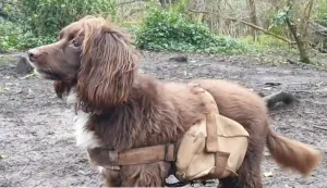
Whether it’s a forest recovering from a wildfire or our own backyards, nature can use some help. Spreading seeds to ensure grass or wildflower growth can be a time-intensive process. However, there is one way that can be fun, quick, and help your dog get some exercise: strapping a backpack full of seeds onto them.
The practice has been popularized internationally by sisters Francisca and Constanza Torres with their three dogs. Many forested areas of their native Chile were devastated by wildfires. The sisters came up with a plan to help reseed and regrow what had been burned down. The two would strap backpacks filled with grass and wildflowers seeds onto their border collies. The backpack had a small opening that would allow the seeds to fall out and spread as their dogs ran, jumped, and played throughout the area.
This helped the forests regrow while also providing the dogs exercise. The dogs were also able to walk into nooks and crannies human planters normally can’t access.
An idea goes international
The idea spread past countries and coastlines as a nature reserve in Lewes, East Sussex, England offered dog walkers backpacks with seeds. The walkers would strap the packs onto their furry friends as they went on nature walks to help rewild the area.
“We’re really interested in rewilding processes, but they often involve reintroducing big herbivores like bison or wild horses,” said the project’s manager Dylan Walker to The Guardian in 2024. “In a smaller urban nature reserve it’s really hard to do those things. So, to replicate the effect that those animals have on the ecosystem we aimed to utilize the vast number of dog walkers that are visiting the nature reserve daily.”
The concept itself was taken from nature. For centuries, wolves would have seeds caught in their fur. Over time, movement, and grooming, the seeds would be spread throughout other areas of the forest. The wolves acted as natural carriers for seeds much like bees are for pollen.
Reseed your garden with Rover
This technique doesn’t have to be reserved for wildfire recovery or regrowing public gardens. Your yard could benefit from it, too. While you could find a pack for your pup and fill it with seeds, there’s another way. Gardener Patrick Vernuccio suggests just filling a tea strainer with seeds and clipping it onto your dog’s collar. It should perform the same effect.
How your Dog can rewild a garden by sowing seeds for Pollinators 🌸🐾🐝 My dog loves to hang out in the garden and now she can also spread out & sow seeds that are beneficial for biodiversity 😍 I use a tea strainer and wildflower seeds for pollinators. 💚 Simply place the seeds inside the tea strainer and close it. 💚 With movement, the seeds will fall off the tea strainer. 💚 Attach it to your dog’s collar and enjoy together some nice time in the garden. And while exploring the garden, your dog will spread out seeds which will give birth to wildflowers, feeding the bees and pollinators. Perfect to rewild the garden and do this before a rainy day to ensure germination or water your garden at sunset. You can easily adapt this technique by using other strainers for bigger seeds. Dogs are definitely man’s best friend and soon, bee’s best friend too 💚 Thank you Bonnie! Green love to you and to your dog! #bee#wildflowers#gardeninglife#dogsoftiktok#rewilding
If you have your dog help seed your yard, be sure that the plants you hope to grow are dog-friendly. Use non-toxic seeds for dogs such as roses, marigolds, and pansies among others. The ASPCA has a full list of plants that are unsafe for dogs to refer to when you’re unsure.
Man’s best friend can also be man’s best gardening buddy.
According to UNICEF, over two billion people live in an area with water scarcity. Climate change, data centers, and other factors are impacting the amount of drinkable water available. However, for the last ten years the women of Morocco have been implementing a water collecting technology that could be useful in other dry areas.
For centuries, the people of Aït Baamrane in Morocco relied on rain and groundwater from wells for drinking and irrigation. It is reported that women of the town would walk four hours to fetch 50-gallon drums of water to carry back. However, intense drought and desertification have made the region even more difficult to live in. Now, they primarily rely on “fog harvesting” for water, with technique showing remarkable success since they started in 2010.
The women-led NGO Dar Si Hmad built what is now the world’s largest operational fog-water harvesting system. This not only has successfully provided an average of 6,300 liters of potable water for more than 400 people in five villages in the area, but significantly reduced the time and physical cost of carrying water.
How fog harvesting works
Fog harvesting is the collection of water droplets from wind-driven fog. While Morocco is a dry area, it does have fog near its mountains and coastal regions. The fog collection system is typically constructed in the form of a mesh net set up and pulled taut between two posts. The net is spread out at an angle that’s perpendicular to the direction of the wind carrying the fog. Freshwater droplets are formed as the fog passes through the net, dripping into a gutter that leads to a storage tank.
The fog-water collected in this particular system goes through a thorough UV, sand, and cartridge filtering process. The system is also solar powered, making it environmentally sound and cheaper than other methods. Since the collected water is pure from the sky, it is free of most contaminants and pollutants.
Fog harvesting expanding
Fog-harvesting/fog-catching has since expanded to other areas of the world. Movimiento Peruanos Sin Agua (Movement of Peruvians without Water) haven’t just built fog-catching nets in Peru, but in rural communities in Colombia, Bolivia, and Mexico. Fog-collectors in Spain collect droplets and water to help offset dry vegetation wildfires on the Canary Islands. Chilean fog harvesters are looking into expansion to help provide water for the poorest communities and dry urban areas.
Other water collecting methods are being tested
Scientists are also trying to find other methods to quickly and effectively draw water from the atmosphere. Researchers at MIT have developed a salt-based hydrogel that collects moisture from water vapor at night between glass panels. These panels create condensation of pure water when they are heated by sunlight. There is also research going into a sonic device that can quickly “shake water out of the atmosphere.”
While scientists are in the midst of finding ways to obtain and conserve water in our future, there are steps people can take today. In terms of water conservation in the United States, the Environmental Protection Agency has some resources that can help. Like collecting fog, collecting folks willing to pitch in can do wonders for the community.