IDEO is one of the world’s most decorated design consultancies. Apple’s first mouse was IDEO’s work. The firm employs experts from disciplines as disparate as graphic design, mechanical engineering and anthropology to create human-centered design solutions for some huge clients.

And they did some work for us too. For GOOD 006 we asked an IDEO team to create the graphic statement-a blank canvas to interpret the issue’s theme: Design Solutions. You can see their piece here. We recently caught up with them to learn more about their work on this project and their process.

Hi. So IDEO is known for its diverse teams. Could you introduce the core team that worked on the GOOD project?

Roshi Givechi: The core team consisted of Ian Groulx, a graphic/communication designer; Beau Trincia, an environments designer; and myself, a new media/interaction designer and storyteller.

What were the very first meetings like?

Ian Groulx: There was a lot of buzz. People wanted to get involved. It wasn’t just a graphic design exercise. We included people from several disciplines in the early brainstorms. The core team then trimmed back down to filter and focus, and when it came time to make it real, we brought in a group of designers to explore the possibilities of how we might execute the final concept.

Did you have any guidelines as you began thinking about the project?

RG: Guidelines? Not so formally. We did aim for a couple of things though: Make it a call to action-an invitation-and make sure the end result reflects that there’s a designer/problem-solver in all of us.

IG: Also, we wanted to stay true to the theme of the issue, and try not to get too deep with content. Our job was to be a spark…an intro to the issue.

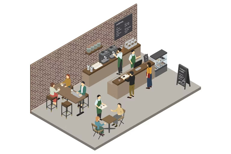
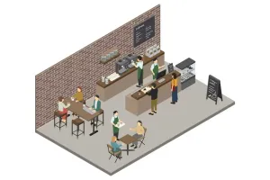
You ended up using a café scene and overlaying a wide range of handwritten design improvements. How did you settle on that picture?

RG: It was partly driven by composition, partly by the serendipity of the people in the view frame, and partly because of the context (a café). It’s a place that a larger population of people will relate to.

The GOOD > GO DO label in the top left: why?

RG: We wanted to leave the page intact because of the existing GOOD logo. It’s a subtle “entrance” and it seemed to respect your magazine as well.

IG: The whole idea that it’s a call to action for those “people who give a damn” seemed fitting. The play on the name of the magazine was the icing on the cake.

I noticed some of the ideas in the piece incorporated sustainability improvements. To what extent is green, or sustainable design becoming synonymous with good design?

RG: To me, in order to design well, we need to consider many threads, and sustainability is thankfully becoming one of the usual suspects.

IG: Our thinking is that sustainability is not just a trend. We think it’s a long-term change in the ways that companies are doing business and people are living their lives. One of the nice things is that a lot of it is happening by choice. People are really motivated to make a difference. Sustainability is part of being good these days. It’s on the checklist, right before kerning.

One of the ideas from your piece is having a billboard double as a climbing wall. That would be a legal nightmare to get done. Even something like getting more street plants would probably get all tied up in a city council. How could the relationship between business or government and design be improved?

RG: Promote human-centeredness as a way to instill trust and promote understanding. Find ways to “see” the same situations together, like swapping roles for a day or two to gain empathy. Communicate the differences in policies or structures and clearly identify the areas where all three can more naturally participate. We’ve found that using design to refine processes and systems is extremely effective.

IG: In general, we tend to like to see “problems” as opportunities for change and improvement. Call us optimists, but we feel we have the collective mindshare to do something and make a difference. In terms of the GOOD issue, we wanted to highlight the importance of finding opportunities before they become a problem. Having a human-centered approach allows for that kind of anticipatory thinking.

Why are we still surrounded by this many potential design improvements?

RG: Products and environments tend to have lasting power, but they don’t necessarily align with current expectations around interactions-thoughtful ones anyway. It’s also in all of our natures to reflect and make better anything that can anticipate and support our next move.

Were there some other compelling ideas for the project that you toyed with?

IG: Absolutely, whenever you have a smart group of people, there’s going to be a lot of ideas on the table. One idea I really liked was a spin on the “This is your brain. This is your brain on drugs.” ad campaign. Spread #1 would have shown the problem and spread #2, the solution. The text was going to read something like “This is a design problem” and “This is a design solution.” Another favorite idea was to supply your readers with a stencil that read “opportunity area” that they could use to signal to others that there is potential for design to make a difference in a particular spot. (Think guerilla marketing).

What was your last home-improvement or DIY project?

RG: I’m on the brink of upgrading all the windows in my place. Aside from the saving energy part, the additional peace alone will be sublime!

IG: I co-planned…organized…designed my wedding. My wife and I are both graphic designers, so you could imagine how detailed and well, detailed, we were. That was quite a project. It was all worth it though. So far…the best day of my life!

  • Indie coffee shops are meant to counter corporate behemoths like Starbucks – so why do they all look the same?
    Photo credit: stomy/iStock via Getty ImagesMany coffee shops today seem to be aesthetically divorced from time and place.

    Like many young, urban professionals, we run on coffee. We especially enjoy frequenting independently owned cafes that pride themselves on ethically sourced beverages, strong local ties and a hip aesthetic.

    They’re the kinds of places that sneer at the homogenization and predictability of Tim Hortons, Second Cup, Dunkin and Starbucks.

    But as public space and consumer culture researchers, we began noticing a pattern: While the invention of new, nondairy milks to mix into lattes continues to amaze us, many U.S. coffee shops seemed to share a similar aesthetic.

    What was up with all the exposed brick? Why did so many of the baristas look cooler than us, but also so similar to one another? And why did most menus appear on a chalkboard, as if we were still in kindergarten?

    Weren’t we supposed to be in one-of-a-kind, authentic settings that make us feel unique and, let’s admit it, slightly elevated?

    As it turns out, the visual patterns we noticed had never been backed up by research. So after a quick cortado, we set out to test our hunch that local coffee shops had adopted a uniform aesthetic.

    Measuring homogeneity

    We asked over 100 American and Canadian young professionals living in cities to share an interior image of their favorite independent coffee shop, describe why they liked the shop’s appearance, and document aspects of its interior design.

    They could select these interior design features from a list of 23 common elements that we had identified in a pilot study – brick walls, marble counters, indoor plants, local art, vintage furniture and even the look of the baristas. Respondents could also write down other details they noticed.

    The elements that they selected and wrote down showed a fascinating overlap.

    Baristas led the pack: Two-thirds of the participants’ favorite local coffee shops had staff with tattoos or piercings. Over half had baristas with beards. Well over half of the respondents noted that their favorite shop had chalkboards, reclaimed wood features, local art, milk foam designs on beverages, local event posters and exposed brick. A large share of the shops had vintage furniture, community message boards and free books available to patrons to read. One-third of the images had indoor plants, trees or greenery.

    Barista with a beard and tattooed hands pours boiling water over coffee grounds.
    Chances are your favorite local coffee shop has a barista with a beard and tattoos. Wera Rodsawang/Moment via Getty Images

    Next up, we challenged the participants to identify the city where these coffee shops were located.

    Using the images provided by the respondents from the initial survey, we asked 158 new and prior participants if they could match the location of the shops depicted in six photographs to Cincinnati, St. Louis or Toronto – cities chosen for their different architectural and aesthetic qualities.

    Not a single participant was able to correctly identify the correct city for all the photos.

    We gave respondents another chance by showing two pictures of coffee shops, one at a time. This time, the two shops were located in Chicago and San Francisco – again, places that pride themselves on their unique and recognizable design culture. They were now given the choice of these key cities to select from, as well as three wrong cities. Only 6% successfully located both coffee shops, and nearly 20% immediately gave up.

    As one participant conceded: “Honestly, these aesthetics are very transferable now … they were random guesses and they could have been in any of the cities mentioned.”

    In other words, independent coffee shops in North America have become so similar aesthetically that their location cannot be picked from a lineup. The purportedly unique and local feel of coffee shops has instead been homogenized into a singular, palatable, North American aesthetic.

    Ironically, these shops have narrowed their aesthetics like a de facto brand franchise – exactly like the chain stores that their patrons ostensibly reject.

    A young woman with dreadlocks pays for her coffee as a smiling young female barista with short hair holds out a card reader.
    Exposed brick, check. Plants, check. Chalkboard, check. Tara Moore/Digital Vision via Getty Images

    Computers and capital

    So why is this happening?

    New Yorker cultural critic Kyle Chayka has attributed aesthetic homogenization to popular social media platforms like Instagram. He calls it the “tyranny of the algorithm”: Social media algorithms promote the visuals that users are most likely to engage with. This, in turn, causes the same types of visuals to be liked and shared, since users encounter them more often. Because the algorithm sees they’re popular, it continues to promote them, in a self-reinforcing cycle. In turn, coffee shop owners also see these online images and try to replicate them in their own establishments.

    Artificial intelligence will likely accelerate the digital homogenization of visual culture, since AI models are trained on massive datasets that feature widely circulated images. Whether it’s popular fashion, architecture or interior design, idiosyncrasies are collapsing into a generic, hegemonic aesthetic – what scholars Roland Meyer and Jacob Birken call “platform realism.”

    Finance plays a role as well. With the average cost of starting a new coffee shop between US$80,000 and $300,000, and with only a small share of coffee shops expected to stay open beyond five years, banks are keen to reduce their risk. Many of them will therefore ask aspiring coffee shop owners to opt for cheaper interior design choices that appeal to the broadest customer base.

    The consumer also plays a role

    But patrons of hip coffee shops may also be to blame.

    Decades before the rise of social media, AI and financial risk management, scholars such as Sharon Zukin revealed how young urban professionals paradoxically embrace the homogenization of their environment in their quest for authenticity.

    Those exposed brick walls? Zukin already described how Manhattan real estate brokers had marketed them to gentrifying SoHo yuppies in the early 1980s.

    Like their predecessors, today’s hipsters, creative professionals and knowledge workers are essentially cultural and aesthetic consumers. Many of them crave visuals – from fashion to architecture – that are different enough to feel cool and authentic, yet safe enough to match their lifestyle and their social status. They want a tasty latte as much as a palatable interior to drink it in.

    Businesses and developers are eager to appeal to these upwardly mobile consumers. At the same time, they want to reach the biggest number of customers. So they tend to create repeatable, homogenized environments in what Zukin describes as a “symbolic economy.”

    In coffee shops, patrons want more than a good espresso. They want to immerse themselves in a “scene” that matches their lifestyle and aspirations. And the exposed brick and the vintage furniture do just that – even if they’ve been copy-and-pasted in cities, small and large, across the nation.

    As we chase authenticity, we may just be finding comfort in carefully curated conformity.

    This article originally appeared on The Conversation. You can read it here.

  • Overpackers love this simple ‘5-4-3-2-1’ packing rule that makes travel way easier
    Photo credit: CanvaAn obvious overpack for travel.
    ,

    Overpackers love this simple ‘5-4-3-2-1’ packing rule that makes travel way easier

    When it comes to travel, packing efficiently is a skill acquired through experience. Lifestyle and content creator Alison Lumbatis shares a helpful 5-4-3-2-1 method designed to take the stress out of packing for both seasoned travelers and first-timers. Trying to pack light while still remembering everything you need can feel a little daunting. A simple…

    When it comes to travel, packing efficiently is a skill acquired through experience. Lifestyle and content creator Alison Lumbatis shares a helpful 5-4-3-2-1 method designed to take the stress out of packing for both seasoned travelers and first-timers.

    Trying to pack light while still remembering everything you need can feel a little daunting. A simple trick is knowing exactly what’s necessary, making your bag lighter and more practical.

    @alisonlumbatis

    Calling all overpackers—this one’s for you! ✈️🧳 The 5-4-3-2-1 packing method is one of my favorites because it’s totally customizable. Prefer dresses? Swap a top and bottom for a dress. Love skirts? Sub them in for pants! These pieces should last you 1-2 weeks, depending on your access to laundry. 🔗’s to everything in bio! #outfitformulas #packinglight #styleconfidence #wardrobemadeeasy #travelcapsule #dailyoutfits #closetconfidence #vacationstyle #fashionover40 #smartstyle

    ♬ original sound – Alison Lumbatis

    Putting The ‘5-4-3-2-1 Packing Method’ Into Action

    In her trending TikTok post, Lumbatis shares a packing system she claims to be “as easy as it sounds.” Here are the basics of the 5-4-3-2-1 packing method:

    • 5 TOPS
    • 4 BOTTOMS
    • 3 SHOES
    • 2 LAYERS
    • 1 MISCELLANEOUS

    Lumbatis explains, “So all you got to do is pick out 5 tops, 4 coordinating bottoms, 3 pairs of shoes, 2 layering pieces, and 1 of anything else. Like a dress, pajamas, a hat, a belt, or any other accessories that you might need. And then of course pack as many undergarments and toiletries as you need.”

    The strategy isn’t just about simplifying and maximizing the number of items you bring on a trip. It’s also about function. “The key is to pick versatile pieces that can mix and match so you can pair them up for whatever activities you have planned for your trip.”

    minimalism, versatile pieces, functionality, packing
    Packing the necessary items
    Photo credit Canva

    Taking Pictures Can Help Plan Ahead

    Another helpful step is taking photos of your outfits to remember how everything fits together. Lumbatis offers, “You can even take pictures of the outfits with you wearing them or flat lays of the pieces and keep them on your phone or in your Notes App — So you can refer back to it on your trip.”

    Is the 5-4-3-2-1 packing method effective? These were some of the thoughts in the comments from readers hopeful to put the plan into action:

    “Great tip for me. Hate packing and never wear all the clothes I bring.”

    “Heading to Japan and I was just going to my closet to put it together. I overpack so this is sooo helpful.”

    “I’m dreading how to not over pack for such a variety of occasions, heat, and limited washing facilities. Ugh.”

    “I struggle with under packing so this is super helpful!”

    travel, adventure, alleviate stress, preparation
    Soaking up the adventure.
    Photo credit Canva

    The Science Behind Good Preparation

    Traveling is a great way to alleviate the stress and burdens of our daily lives. A 2025 study in Springer Nature Link showed travel helped people improve their long-term resilience by creating positive emotions while ecouraging self reflection. National Geographic found the benefits of travel begin even before the trip begins.

    However, preparation can have a powerful effect on the simple stresses a person might acquire during traveling. A 2025 study revealed that planning reduced anxiety and helped people prepare for delays or unexpected changes. Research in 2025 reported by AP News found that even making a simple checklist reduced anxiety and helped make for smoother trips.

    Lumbatis claims, “If you struggle with overpacking and want to create a great capsule wardrobe packing list, you’ve got to try this method.”

    People hope that traveling will relieve stress more than generate it. The 5-4-3-2-1 packing method offers a clear and simple way to pack just what you need. Careful preparation helps prevent last-minute chaos and produces a more enjoyable trip. Hopefully, this method can help you spend less time worrying and more time soaking in the adventure.

    Watch this YouTube video on incredible vacation destinations to inspire your next trip:

  • People are cheering woman’s refusal to accept the latest trend in hotel bathrooms
    Photo credit: @bring_back_doorsSadie has declared war on non-private hotel bathrooms.

    People are cheering woman’s refusal to accept the latest trend in hotel bathrooms

    “I HATE how hotels started thinking going to the bathroom is a shared experience.”

    It can be frustrating seeing change for change’s sake in the world. To be more specific, changes that are said to be done in the name of innovation and design, but are in truth ways for companies to save a buck.

    One example that is getting attention is the bathroom doors in hotels… or the lack thereof, actually. One TikToker has had enough and has taken it upon herself to save regular bathroom doors in hotels and to point out why open-space bathrooms and glass doors just don’t cut it.

    On her @bring_back_doors TikTok account, Sadie has a collection of videos highlighting the flaws in hotel bathroom designs, with the most prominent being the lack of a regular door to the bathroom. In one viral TikTok, Sadie discussed a hotel that reached out to her, explaining that they have “foggy” glass doors to their bathroom to provide privacy. She was quick to point out that it still doesn’t provide adequate privacy. “Yes you can see through these,” Sadie said, adding that “glass doors do not close properly.”


    @bring_back_doors

    Hotel name: Alexander Hotel, Noordwijk aan Zee, Netherlands I need to be clear. Glass doors are not private. And making them foggy does not make them private. I am once again sitting here saying screw you to all bathroom doors that are not solid and close fully. And I am providing alternative hotels with guaranteed doors at bringbackdoors.com Check your hotels door situation before you book or risk your privacy. Door submitted by @mmargaridahb, DM me to submit your own bad doors. #bathroomdoors #hotel #travel #fyp Bathroom doors | bathroom design | hotel design | bad hotel design | travel fail | travel memories | travel inspo | door design | hotels with privacy

    ♬ original sound – Bring Back Bathroom Doors

    The comments rallied behind Sadie’s bathroom-door crusade

    The commenters joined in with Sadie, demanding the return of solid, closing, and lockable doors to bathrooms in hotels:

    “I HATE how hotels started thinking going to the bathroom is a shared experience.”

    “I hate how you can’t turn the bathroom light on without disturbing the other person in the room.”

    “The foggy ones are almost worse, you just get a hazy fleshy silhouette hunched over on the crapper like some kind of sack of ham.”

    “I just don’t get it, NOBODY wants this, even couples. I won’t be more likely to book two separate rooms for me and my friend/sibling/parent, I’ll just book another hotel.”

    “Love this campaign, I do not want a romantic weekend listening to the other person poo.”


    @bring_back_doors

    Hotel Names⬇️⬇️ Citizen M South Hotel (first pics) and Fletcher Hotel (third pic) both in Amsterdam. As part of this project, I’ve been emailing hotels around the world to put together an easy to reference list for people to find hotels with guaranteed doors at BringBackDoors.com And I did notice that in Amsterdam a lot of hotels were saying they don’t have doors. It wasn’t the worst city (that honor goes to Barcelona, so far I’ve only found TWO that have said yes to all doors), but it was still bad. Then I went into the comments. And kept getting people mentioning these hotels in Amsterdam. And I realized that clearly the city has a designer or architect on the loose who has a thing for test tubes. It’s horrible. Luckily, I was able to find 6 hotels in Amsterdam that all have bathroom doors in every room and have them all listed on BringBackDoors.com These hotels were submitted by so many people I couldn’t name them all. But to submit your own bad hotel bathroom send me a DM with hotel photo, name, and location! #hotel #bathroom #hoteldesignfail Bathroom doors | hotel bathrooms | hotel privacy | no privacy | travel problems | hotel issues | travel | hotel design | hotel design fail | hotel designers | design fail | hotel concept | bathrooms | Citizen M | Hotel Fletcher | Hotels in Amsterdam | Visit Amsterdam | Amsterdam

    ♬ original sound – Bring Back Bathroom Doors

    A great way to save a buck—er, I mean, ‘create a modern look’

    As many commenters asked, why do hotels have glass doors — or, worse, no doors at all—in their bathrooms? Well, this has been a growing trend in modern hotels over the past decade as a means to create a sleek aesthetic and to allow glass partitions to bring more daylight into otherwise darker sections of the room.

    At least that’s what’s being promoted to the customer. In reality, skimping on solid doors for glass ones or none at all gives the illusion that the room is bigger than it is while requiring fewer building materials. It does bring in more daylight, but mostly with the hope that you’ll cut down on electricity use for lights in an otherwise enclosed space. These reasons are also why some hotels don’t have solid walls around their bathroom areas at all.

    TikTok · Bring Back Doors

    TikTok u00b7 Bring Back Doors www.tiktok.com


    Tired of the lack of privacy? Check out the database

    To combat this trend, Sadie has developed a database at bringbackdoors.com for her and her followers to report which hotels have true, solid, private bathrooms in their accommodations and which ones do not, so people can properly plan where to stay and have true privacy during their most vulnerable moments.

    “I get it, you can save on material costs and make the room feel bigger, but what about my dignity?,” Sadie wrote on her website. “I can’t save that, when you don’t include a bathroom door.”

    Over time, the hope is that sanity and dignity can be restored as hotels realize that their glass “features” don’t have any real benefit when they don’t allow basic privacy.

Explore More Design Stories

Design

Indie coffee shops are meant to counter corporate behemoths like Starbucks – so why do they all look the same?

Culture

Overpackers love this simple ‘5-4-3-2-1’ packing rule that makes travel way easier

Design

People are cheering woman’s refusal to accept the latest trend in hotel bathrooms

Design

MIT’s super-fast camera can capture light as it travels