Breaking the news to your kids that you’re moving can be tough. But one Georgia dad found a way to turn potential tears into cheers—with a PowerPoint presentation that was equal parts thoughtful, practical, and fun.
Digital creator Lorelle Oliveira Sherman shared the moment on Instagram, showing how her husband, Greg-Karlton Sherman, delivered the news to their three kids that the family was moving from Smyrna to Snellville, Georgia.
“WE ARE MOVING Greg made an entire PowerPoint so we could share with the kids all the pros of moving to a new city! (The perks of marrying a teacher of 13 years because the PowerPoint was so good ),” she wrote in the caption. “Can’t wait to take y’all on this journey! Shermans in Snellville .”
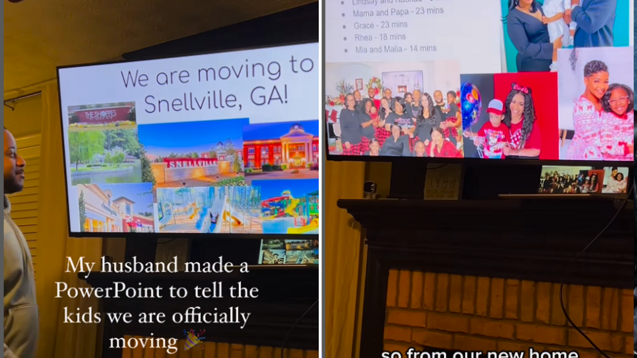
The video starts with Greg standing in front of a TV, clicker in hand, ready to take his family through the big reveal. The first slide sets the tone: “Moving to a new city is a significant decision that involves careful planning and consideration. This presentation outlines the plan for relocating our family to Snellville, Georgia, and highlights the benefits of making this city your new home.”
Man making PowerPoint presentation Canva
Then comes the slide titled “Why Are We Moving?” The answer is simple: the house they’re in is too small, and with only three bedrooms, the kids need more space. More rooms, more privacy, fewer arguments—it’s an easy sell.
Greg then highlights what might just be the most compelling reason of all: family and friends. The slides include names, faces, and travel times to each loved one’s house. Nine minutes to this cousin, twenty-three to that best friend. The kids immediately light up.
Family moving Canva
Then comes the “Shopping” slide, and things get real. Greg unveils a list of stores near their future home: Target, Barnes & Noble, Bath & Body Works, and Sephora. That last one gets a huge reaction from Lorelle and their oldest daughter. It’s safe to say Sephora sealed the deal.
Greg isn’t done yet. The “Activities” slide reassures the kids that their beloved cheer team and other extracurriculars are all available in Snellville, too. Lorelle cheers from behind the camera while Greg keeps the positive energy rolling.
Woman enjoying the presentation Canva
He even breaks down the “Moving Plan” by week. It’s clear, structured, and totally manageable. Week 1: purge and buy supplies. Week 2: pack stuff you don’t use daily. Week 3: kitchen items. Week 4: still TBD. Week 5: make it happen.
And then comes the mic drop: a $150 “New Room Allowance” for each kid to decorate their new space. Suddenly, this isn’t just a move—it’s an adventure.
Moving can be fun sometimes Canva
The internet responded with overwhelming love for the presentation and the parenting behind it.
“I’m crying, this is seriously such a nice, respectful, and loving way to tell your kids you’re moving,” one commenter wrote. “Something I never got moving around all the time as a military brat.”
“Ha ha! Once a teacher, always a teacher! ” added another.
One comment especially captured the vibe of the whole thing: “Honestly glad to see dad taking the lead, setting the tone, and managing expectations in the household. The ‘why’ is important… and shout out to momma for being the best hype woman everrrr!! ”
Happy family Canva
Greg didn’t just make a PowerPoint. He created a roadmap for change—and brought his family along every step of the way.
Taking the stage at Coachella, singer Justin Bieber gave fans something unique: singing along to a YouTube video of himself at just 13, he harmonized on songs like “Baby,” “Never Say Never,” “With You,” and others.
Blake Roberts, a licensed therapist and self-proclaimed “dude,” shared his perspective on Bieber’s performance. While reactions to the appearance may be mixed, Roberts found it courageous.
“From the perspective of a therapist and dude, I have to talk about this Justin Bieber-Coachella thing,” Roberts said in an Instagram Reel. “If you’ve ever done any amount of inner child work, you can appreciate what that moment was.”
“That little boy was artistic and creative. Just doing his thing. Probably got made fun of a bunch, and then he gets thrown into this industry. And he loses parts of himself, and people probably take advantage of him,” he added.
Roberts turned the performance into a learning experience, discussing a form of therapy known as inner child work:
“Like we watched this man’s trauma, and yet he still shared a moment with us. Like a peek inside what it looks like to do inner child work. What looks like to look back at the younger versions of ourselves who have been rejected, who have been abused, who we ourselves have left behind. And to look at them with compassion and see them from the purity that they were.”
Bieber’s performance relied heavily on nostalgia and early-career callbacks. A review in Entertainment Weeklydescribed the set as “lacking some swag.” For much of the performance, Bieber sat at a desk onstage, scrolling through viral videos of himself.
Despite negative feedback on his set, some fans appeared to be very appreciative of Bieber. One fan commented on Roberts’ Instagram post, saying, “I loved it so so much, aaaand now I’m crying again.”
Regardless of whether people admire what the artist did, Roberts saw an opportunity to highlight recovery and the value of therapy. Bieber’s duet with his younger self could be seen as a meaningful act of openness and vulnerability. Roberts reflected, saying, “I thought it was pretty crazy. I could feel it.”
Bieber’s challenges scrutinized by the public
For those unfamiliar with Bieber’s personal life, he has faced some rough patches, as rumors have circulated about a struggling marriage and financial difficulties.
The obstacles began to appear in 2017, when Bieber pulled out of a world tour due to mental exhaustion. In 2022, he posted on Instagram about the challenges of dealing with Ramsay Hunt syndrome. The illness occurs when the chickenpox virus reactivates later in life, causing facial weakness. Bieber said he was experiencing facial paralysis on his right side, which led him to cancel his tour again.
There have also been allegations, including claims of drug use and questions about Bieber’s friendship with Sean “Diddy” Combs dating back to his youth. Clips have resurfaced showing Bieber as a teenager spending time with the music mogul. However, Bieber has not made any clear, on-the-record statements about that time.
Signs are meant to inform, warn, or direct, but sometimes, they unintentionally entertain. Whether due to poor wording, clever humor, or just plain absurdity, some signs end up being comedic gold.
Thanks to the internet, we no longer have to stumble upon them by accident—there’s even a whole subreddit, r/funnysigns, dedicated to collecting the most ridiculous ones.
Here are 25 of the funniest signs that prove not all signage is created equal.
1. Some people might need this reminder
“Not knowing who Taylor Swift is doesn’t make you interesting.”
Like many young, urban professionals, we run on coffee. We especially enjoy frequenting independently owned cafes that pride themselves on ethically sourced beverages, strong local ties and a hip aesthetic.
They’re the kinds of places that sneer at the homogenization and predictability of Tim Hortons, Second Cup, Dunkin and Starbucks.
What was up with all the exposed brick? Why did so many of the baristas look cooler than us, but also so similar to one another? And why did most menus appear on a chalkboard, as if we were still in kindergarten?
Weren’t we supposed to be in one-of-a-kind, authentic settings that make us feel unique and, let’s admit it, slightly elevated?
As it turns out, the visual patterns we noticed had never been backed up by research. So after a quick cortado, we set out to test our hunch that local coffee shops had adopted a uniform aesthetic.
Measuring homogeneity
We asked over 100 American and Canadian young professionals living in cities to share an interior image of their favorite independent coffee shop, describe why they liked the shop’s appearance, and document aspects of its interior design.
They could select these interior design features from a list of 23 common elements that we had identified in a pilot study – brick walls, marble counters, indoor plants, local art, vintage furniture and even the look of the baristas. Respondents could also write down other details they noticed.
Baristas led the pack: Two-thirds of the participants’ favorite local coffee shops had staff with tattoos or piercings. Over half had baristas with beards. Well over half of the respondents noted that their favorite shop had chalkboards, reclaimed wood features, local art, milk foam designs on beverages, local event posters and exposed brick. A large share of the shops had vintage furniture, community message boards and free books available to patrons to read. One-third of the images had indoor plants, trees or greenery.
Next up, we challenged the participants to identify the city where these coffee shops were located.
Using the images provided by the respondents from the initial survey, we asked 158 new and prior participants if they could match the location of the shops depicted in six photographs to Cincinnati, St. Louis or Toronto – cities chosen for their different architectural and aesthetic qualities.
Not a single participant was able to correctly identify the correct city for all the photos.
We gave respondents another chance by showing two pictures of coffee shops, one at a time. This time, the two shops were located in Chicago and San Francisco – again, places that pride themselves on their unique and recognizable design culture. They were now given the choice of these key cities to select from, as well as three wrong cities. Only 6% successfully located both coffee shops, and nearly 20% immediately gave up.
As one participant conceded: “Honestly, these aesthetics are very transferable now … they were random guesses and they could have been in any of the cities mentioned.”
In other words, independent coffee shops in North America have become so similar aesthetically that their location cannot be picked from a lineup. The purportedly unique and local feel of coffee shops has instead been homogenized into a singular, palatable, North American aesthetic.
Ironically, these shops have narrowed their aesthetics like a de facto brand franchise – exactly like the chain stores that their patrons ostensibly reject.
New Yorker cultural critic Kyle Chayka has attributed aesthetic homogenization to popular social media platforms like Instagram. He calls it the “tyranny of the algorithm”: Social media algorithms promote the visuals that users are most likely to engage with. This, in turn, causes the same types of visuals to be liked and shared, since users encounter them more often. Because the algorithm sees they’re popular, it continues to promote them, in a self-reinforcing cycle. In turn, coffee shop owners also see these online images and try to replicate them in their own establishments.
Artificial intelligence will likely accelerate the digital homogenization of visual culture, since AI models are trained on massive datasets that feature widely circulated images. Whether it’s popular fashion, architecture or interior design, idiosyncrasies are collapsing into a generic, hegemonic aesthetic – what scholars Roland Meyer and Jacob Birken call “platform realism.”
Finance plays a role as well. With the average cost of starting a new coffee shop between US$80,000 and $300,000, and with only a small share of coffee shops expected to stay open beyond five years, banks are keen to reduce their risk. Many of them will therefore ask aspiring coffee shop owners to opt for cheaper interior design choices that appeal to the broadest customer base.
The consumer also plays a role
But patrons of hip coffee shops may also be to blame.
Decades before the rise of social media, AI and financial risk management, scholars such as Sharon Zukin revealed how young urban professionals paradoxically embrace the homogenization of their environment in their quest for authenticity.
Those exposed brick walls? Zukin already described how Manhattan real estate brokers had marketed them to gentrifying SoHo yuppies in the early 1980s.
Like their predecessors, today’s hipsters, creative professionals and knowledge workers are essentially cultural and aesthetic consumers. Many of them crave visuals – from fashion to architecture – that are different enough to feel cool and authentic, yet safe enough to match their lifestyle and their social status. They want a tasty latte as much as a palatable interior to drink it in.
Businesses and developers are eager to appeal to these upwardly mobile consumers. At the same time, they want to reach the biggest number of customers. So they tend to create repeatable, homogenized environments in what Zukin describes as a “symbolic economy.”
In coffee shops, patrons want more than a good espresso. They want to immerse themselves in a “scene” that matches their lifestyle and aspirations. And the exposed brick and the vintage furniture do just that – even if they’ve been copy-and-pasted in cities, small and large, across the nation.
As we chase authenticity, we may just be finding comfort in carefully curated conformity.