Among the many, many uncomfortable truths laid bare by the police-involved deaths of unarmed black men like Mike Brown and Eric Garner has been this: The lack of comprehensive data on police violence across the country has often hindered the progress of those advocating for change both in their communities and in our nation as a whole. The American Civil Liberties Union reports that:
While the Department of Justice provides detailed information on its pattern and practice investigations and settlements against police departments, very little data or documents have been provided to back up the numbers of federal criminal civil rights prosecutions or to see how they have changed over time.
So while there is some data out there, it’s often incomplete, disparate, and not easily accessible – especially for ordinary people seeking to address both the issue of and possible solutions for police violence in their communities. It’s with that in mind the organizers behind “We The Protesters”–an online hub for activists founded after the death of Mike Brown in Ferguson, Missouri–created “The National Police Violence Map.” As they explain on the site’s homepage:
This map, a project of WeTheProtesters.org, bears witness to the black men and women who have been killed at the hands of law enforcement in 2014. And while a focus on police killings cannot capture the full scale of the violence our communities face at the hands of police, we hope this data helps communities better understand the problem and begin to make progress towards addressing it
The map itself is a dynamic, layered timeline of the 302 deaths of black men and women that took place as a result of police violence in 2014.
To populate their map, the team behind the site drew data from FatalEncounters.org, the U.S. Police Shootings Database, and KilledbyPolice.net, which they describe as “the three largest, most comprehensive, and impartial crowdsourced databases on police killings in the country.” They then augmented that data with their own research, “searching social media, obituaries, police reports, and other sources to identify the race of close to 90 percent of all victims in the database” in order to arrive at what they claim is the “most comprehensive” accounting of police-caused deaths throughout last year.
Using their culled data, the site also lets users monitor national trends in violence, and even compare police departments, using the interactive chart below:
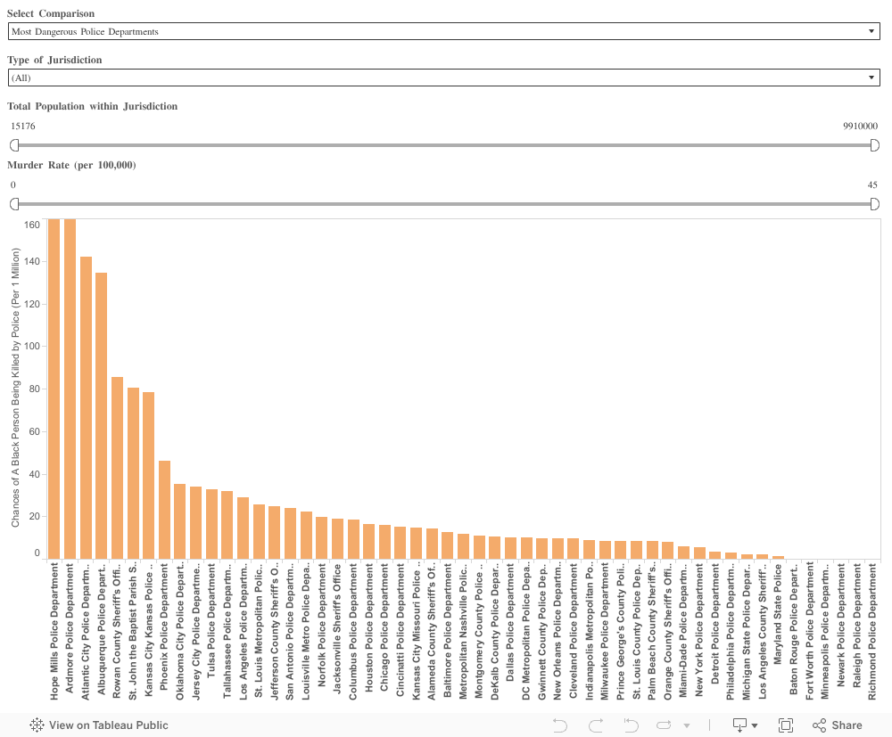
While it is an an admittedly incomplete database, The National Police Violence Map offers a stark snapshot of what many communities have dealt with over the past year. But, thanks to resources like this, communities have a growing set of tools to help ensure there will be far fewer deaths for the map to track in years to come.