The world is both a bigger place and a smaller place than you probably previously thought it to be.
A video created in 2016 by RealLifeLore shows the Earth is actually different from how it’s depicted on traditional maps. The simple reason is this: The Earth is a sphere and that means it is impossible to accurately depict its surface on a two-dimensional map.
The traditional map we all used in school is known as a Mercator projection. According to RealLifeLore, it’s “actually a really useful map for navigation and on keeping the correct shape of countries,” but it fails to accurately represent the actual size of countries in relation to one another.
To put things simply, on the Mercator projection, the further a country is from the equator, the greater its size is exaggerated. Conversely, the closer an object is to the equator, the more its size is diminished. So a country like Greenland appears to be much larger than it actually is, while Brazil is not as small as you might think.
To explore the real size of countries yourself, check out The True Size.
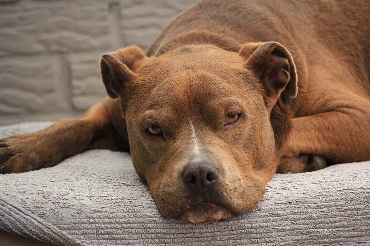
Reddit user Girlfriendhatesmefor’s three-year-old pitbull, Otis, had recently become overprotective of his wife. So he asked the online community if they knew what might be wrong with the dog.
“A week or two ago, my wife got some sort of stomach bug,” the Reddit user wrote under the subreddit /r/dogs. “She was really nauseous and ill for about a week. Otis is very in tune with her emotions (we once got in a fight and she was upset, I swear he was staring daggers at me lol) and during this time didn’t even want to leave her to go on walks. We thought it was adorable!”
His wife soon felt better, butthe dog’s behavior didn’t change.
Girlfriendhatesmefor began to fear that Otis’ behavior may be an early sign of an aggression issue or an indication that the dog was hurt or sick.
So he threw a question out to fellow Reddit users: “Has anyone else’s dog suddenly developed attachment/aggression issues? Any and all advice appreciated, even if it’s that we’re being paranoid!”
The most popular response to his thread was by ZZBC.
Any chance your wife is pregnant?
ZZBC | Reddit
The potential news hit Girlfriendhatesmefor like a ton of bricks. A few days later, Girlfriendhatesmefor posted an update and ZZBC was right!
“The wifey is pregnant!” the father-to-be wrote. “Otis is still being overprotective but it all makes sense now! Thanks for all the advice and kind words! Sorry for the delayed reply, I didn’t check back until just now!”
Redditors responded with similar experiences.
Anecdotal I know but I swear my dog knew I was pregnant before I was. He was super clingy (more than normal) and was always resting his head on my belly.
realityisworse | Reddit
So why do dogs get overprotective when someone is pregnant?
Jeff Werber, PhD, president and chief veterinarian of the Century Veterinary Group in Los Angeles, told Health.com that “dogs can also smell the hormonal changes going on in a woman’s body at that time.” He added the dog may “not understand that this new scent of your skin and breath is caused by a developing baby, but they will know that something is different with you—which might cause them to be more curious or attentive.”
The big lesson here is to listen to your pets and to ask questions when their behavior abruptly changes. They may be trying to tell you something, and the news may be life-changing.
Throughout history, women have stood up and fought to break down barriers imposed on them from stereotypes and societal expectations. The trailblazers in these photos made history and redefined what a woman could be. In doing so, they paved the way for future generations to stand up and continue to fight for equality.
While conspiracy theories are not limited to any topic, there is one type of event that seems particularly likely to spark them: mass shootings, typically defined as attacks in which a shooter kills at least four other people.
When one person kills many others in a single incident, particularly when it seems random, people naturally seek out answers for why the tragedy happened. After all, if a mass shooting is random, anyone can be a target.