You’ve almost certainly been sent this chart or seen it on a blog (BoingBoing and Andrew Sullivan being the biggest culprits I’ve seen). Now trust me, I’m pretty sure the economy is in the crapper, but this chart is a wee bit misleading.
That plunging green line, that’s the total number of job losses during this recession, as compared to the two recessions before it. You know what happened in between those recessions? We created a lot of jobs and got a lot more people. So, while the total number of unemployed may be greater this time around, percentage wise (which is what the unemployment rate is), we’re still doing ok. And by “ok” I mean, still really horribly but just about as horribly as the last three recessions. You should also note that the last two recessions (1990 and 2001) were much, much less bad than this one to begin with. It’s really more helpful to compare this to 1981, when things were at a level of badness comensurate with what we’re experiencing now. Take a look at this chart:
This is a chart (via the Corner) that shows the unemployment rate during the recessions. As you can see, while the numbers start at different places, the rate of increase is basically the same. So, don’t worry too much, this recession is still performing just like we think a recession should. But, also remember that job losses generally peak after the recession had officially ended. So, either things are secretly getting better and we’ll find out soon, or, more likely, we potentially have a long, long way to go.
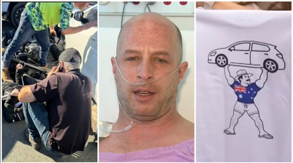
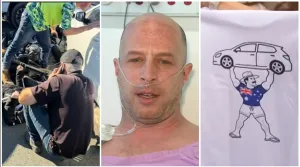
Tyler Wiebe was on his way to work on his motorcycle in Brisbane, Australia. Then a car approached in the wrong way in traffic, colliding with another car that then hit Wiebe. The accident threw Wiebe off his bike and under a car. He was trapped under the 3,300-lb. vehicle, doomed until a group of salesmen and onlookers came to his rescue.
“I was being dragged and when it stopped, my head and chest were under the car,” Wiebe said to the Australian Broadcasting Corporation. The crash and being pinned down under the vehicle gave Wiebe several injuries. He suffered broken ribs, a broken collarbone, and a collapsed lung.
But that would be diagnosed later. At the time, the car’s weight was crushing Wiebe to the point that he couldn’t breathe. His heart was also unable to beat, the pressure causing his eyes, mouth, and nose to bleed.
“Initially it was ‘can I get out?’ and then it was ‘man I am dying, this is it,’” recalled Wiebe. “[My] wife and two kids are not here, and this is it.”
Hope comes in the form of a car salesman
After being stuck for two minutes under the car, help arrived from the nearby Auto Request Kedron, a used car dealership.
“I was in the office at the time, so I heard the bang [and] came running to the doors,” Mick, one of the employees, said to A Current Affair.
“I realized there was someone trapped under the car,” fellow employee Rob added.
They rushed into action, recruiting other coworkers to help.
“[I] saw Rob running and he was just whistling out saying, ‘Hey, boys, hurry up,’ ” Corbin recalled. “I remember seeing him, just like two legs. They weren’t moving at that time.”
The salesmen tried to lift the vehicle up to get Wiebe to safety, but the car wouldn’t budge.
“We tried to lift it off. We couldn’t, and then on the second attempt, we had a couple of other good Samaritans come and help us,” said Brian, another employee of Auto Request Kedron.
Reportedly 15 people were finally able to lift the car and free Wiebe underneath. He was rushed to the hospital where he went under emergency operations. Under hospital care, Wiebe’s condition stabilized and he survived. Had he been under that car any longer, the worst would have happened.
Wiebe was humbled and grateful to the salesmen and others who stepped up to save him.
“I get more time with my daughters, I get more time with my family and a second lease on life, so just thank you, thank you,” Wiebe said in his hospital bed.
When he was discharged from the hospital, Wiebe set up a reunion with the employees of the used car dealership. He was able to introduce his family to his rescuers and thank them face-to-face. Wiebe presented them with matching t-shirts, each one with a logo reading “Certified Legend” on the front and an illustration of a person lifting a car over their head on the back.
“You guys are legends, but now you’re certified legends,” Wiebe said to his heroes.
A father and husband was saved thanks to the alertness and quick action of the nearby community.
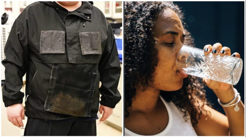
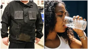
For too many, access to clean drinking water is incredibly difficult. According to the World Health Organization, over two billion people live in water-stressed areas due to pollution, climate change, or population growth. However, engineering experts in Texas have developed a possible solution: just put on a jacket.
The engineers and researchers gathered at the University of Texas at Austin developed a prototype jacket that can pull drinking water out of thin air. The jacket could help anyone frequently in areas where drinkable water is scarce. This could be used recreationally by campers, hikers, and runners—but it could also save lives. Emergency responders, soldiers, and agricultural workers could also collect water for themselves and others simply by wearing it.
The technology behind the jacket is similar to the materials used in netting for water harvesting of air and fog. This time, however, the idea is to collect water while also being mobile.
“Water harvesting from air is usually imagined as a stationary device such as a box, a panel or a large sorbent bed,” said Guihua Yu, chair professor of the Cockrell School of Engineering’s Walker Department of Mechanical Engineering and Texas Materials Institute. “Here, we wanted to rethink the form of the technology. If the fabric itself can collect water from air, it opens a new direction for personal and portable water access.”
How does this jacket collect water?
The textile used to create the jacket was derived from a device the same team created. That device was a specially engineered hydrogel fabric made from biomass-derived materials. This hydrogel fabric takes moisture from the air and then releases it as water via condensation when it’s heated by sunlight. The water can easily be collected.
The jacket’s textile collects moisture from the air and funnels it into detachable harvesting units. The units can be placed into a foldable collector piece where they are heated to produce water. The material and system doesn’t just absorb water like other materials. Instead, it actively converts vapor into water while functioning as a piece of protective clothing.
The jacket is able to produce between 400 to 900 milliliters of drinkable water daily. This is a vast improvement upon other similar inventions that yielded less water and were significantly bulkier to wear. The jacket’s material could collect and produce more water over time and testing, depending on the humidity of the terrain.
Aside from creating clothing out of the material, the researchers hope to make backpacks, tents, emergency shelters, and other outdoor gear from it. The hope is that this could create more clean water access for disaster response units and everyday people living in water-stressed areas alike.
How much hydration do you need in the heat?
Until water-collecting jackets are commercially available, it’s important to have drinkable water nearby at all times, especially during the summer. When out in the heat, the Center for Disease Control recommends having a drink of water before working outdoors. Then drink a cup of water every 15 to 20 minutes. This can help keep your body cool and hydrated to prevent heat stroke. That said, stay alert and stay indoors if there is a heat warning in your area.
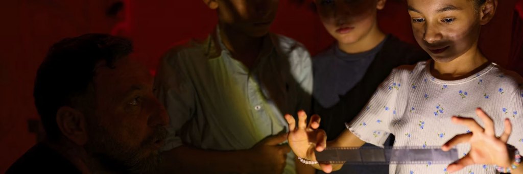
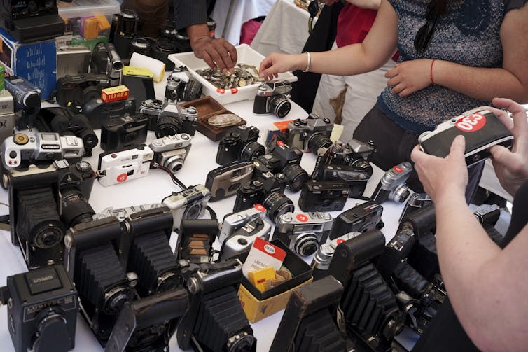
Photo credit: Yasin Akgul/AFP via Getty Images – Children look at developed film in a darkroom during an analog photography workshop held in southeastern Turkey on June 14, 2026.
Film photography is experiencing a resurrection, summoned by unlikely conjurers: Gen Z.
It wasn’t too long ago that analog photography – which uses photographic film and chemical processing – was declaredall but dead, relegated to the province of niche hobbyists and professional artists.
Digital cameras had taken over nearly all areas of photographic production. Film industry titans like Polaroidand Kodak had shrunk dramatically from their heyday, becoming shells of their former selves. Darkrooms, where students learned how to manually develop and print film, shutteredat high schools and college campuses across the country, replaced by digital labs. For most people, the spirit of analog photography was mainly channeled through Instagram filters.
In 2025, 35% of the 42 million active film camera users worldwide were reported to be between the ages of 18 and 30. The year prior, online searches for analog photography saw a 41% rise.
Disposable camera sales have been steadily increasing since 2023. The photography journal PetaPixel went a step further and announced 2024 as “film’s best year in decades,” as major brands have introduced new cameras in response to renewed demand and revived classic models. More than 30% of respondents to a 2024 Ilford Photo survey on film photography were in the 25-34 age group.
As I’ve witnessed more and more of my undergraduate art and design students embrace analog photography, I’m not seeing this as a trend rooted in a nostalgic yearning for the past. Instead, I’m seeing it as young people rejecting algorithms, breaking free from the alienation of social media and reacting to childhoods spent on Zoom and TikTok – a deliberate move to redefine the future of art, social connection and engagement with the world.
Pining for a ‘third place’
In my work as a historian of photography and lecturer at the University of Southern California, I’ll often ask my students about how they take photos – whether they’re using digital cameras their smartphones or analog devices.
This year, for the first time, some of my students discussed images they’d printed and the physical photography albums they’d put together of their friends and family. They talked about how they’d also been sending postcards, writing letters and tacking photographs to their bedroom walls.
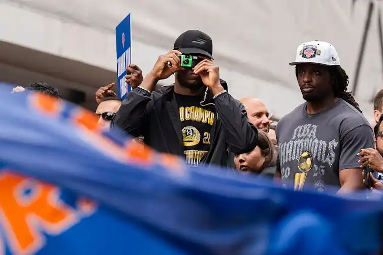
New York Knicks forward OG Anunoby snaps a photo with a disposable film camera during the team’s victory rally on June 18, 2026, after winning the NBA Finals. Craig T. Fruchtman/Getty Images
This was a rhetorical move by social media companies, likely designed to help people feel as though they were in a familiar terrain of social connection. Yet the underlying business model of these platforms depended more on maximizing engagement and advertising revenue than on nurturing authentic relationships.
Everyone knows what happened next: The more connected young people became online, the more isolated and detached they started to feel. The COVID-19 lockdown pushed social life online even further, and researchers are only now starting to see how the combination of increased screen time and isolation negatively affected adolescents’ mental health. By 2023, 51% of American teenagers reported they spend at least four hours a day on social media.
I see the attraction of analog photography as a response to life lived through screens, a pathway toward community engagement and the desire for what sociologists call “a third place.”
Coined by sociologist Ray Oldenburg in his 1989 book “The Great Good Place,” third places are meant as a space separate from home and work. They offer a reprieve for the in-between, generating the conditions needed for creative cross-pollination. They might include a local cafe, a neighborhood writing group, a weekly Magic: The Gathering game or a college fraternity – any space that allows for social interaction and personal growth.
These spaces also combat loneliness. They get people out of their heads and into a community. Oldenburg also referred to them as “havens of sociability,” places or gatherings where people can arrive alone to join others, and the atmosphere is “democratic and festive.”
Analog communities IRL
In April 2026, the inaugural AnalogCon took place in Los Angeles. Organized by the Los Angeles Center of Photography, where I serve as executive director and chief curator, it was a festival for all things analog photography. It didn’t just serve as a third place for photography enthusiasts; it also showed how analog photography – as a practice, ritual and community – is flourishing.
Vendors, industry leaders, artists and teachers participated in the two-day event, which included exhibitions, panels, demonstrations and guided photography tours around Little Tokyo. The excitement and thirst for similar events was palpable.
Photography now joins a broader trend of a generational preoccupation with physical cultural objects and media. Although music streaming represents 82% of revenues generated in the music industry, vinyl records sales have been rising for over a decade, crossing the US$1 billion threshold in the U.S. in 2025.
But beyond that, record stores and video rental shops have become third places in their own right. There’s a big difference between selecting a film to stream from your bed and getting out of the house, going to a store and talking about movies with a clerk and fellow film enthusiasts.
Think about the sound a tape cassette makes when you open and close it, or the vibrant graphics on the covers of DVDs or VHS tapes. Think about rewinding or making a mixtape for your recent crush. These are objects of belonging that signal specific cultural moments, rituals and aesthetics, and many young people today are starting to experience them for the first time.
Now, think about gently inserting a roll of film into a camera. Think about choosing an angle carefully when snapping a photo, because the number of frames is limited and you want to make them count. Think about the thrill of discovery when the pictures finally emerge as objects on paper.
To me, these are more than fleeting trends. They signal a push against a digital culture that is designed to cultivate envy and reward outrage, insults and humiliation.
Instead, armed with rolls of film, more and more Gen Zers appear to be opting out of their algorithmic feeds in favor of experiencing life in ways that feel more deliberate, personal and tangible.